 Custom visuals for Power BI
The most complete visual in every category we ship.
Gantt, Radar, Cohort Retention, Pareto, News Ticker and the Research suite. Each one covers what every alternative on AppSource does, then the gaps none of them fill. The default render is already the screenshot, and the format pane reads like your data model.
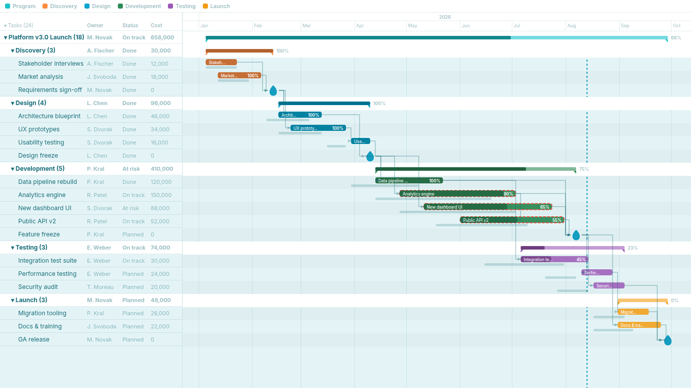
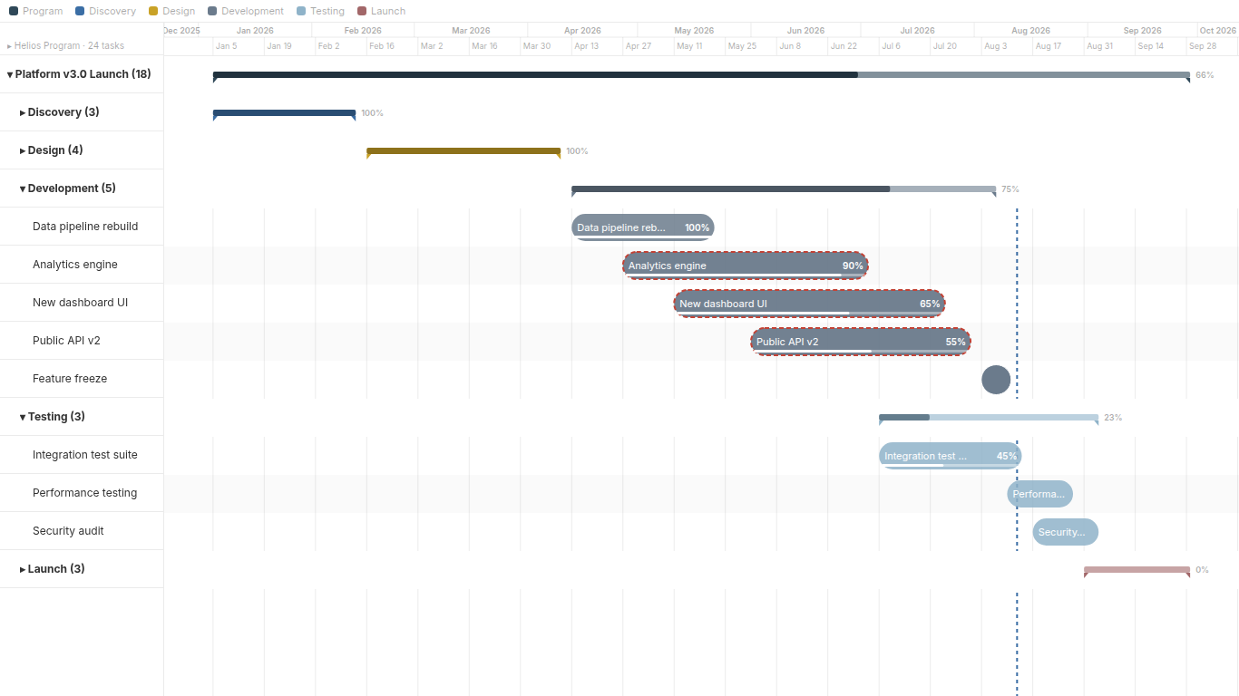
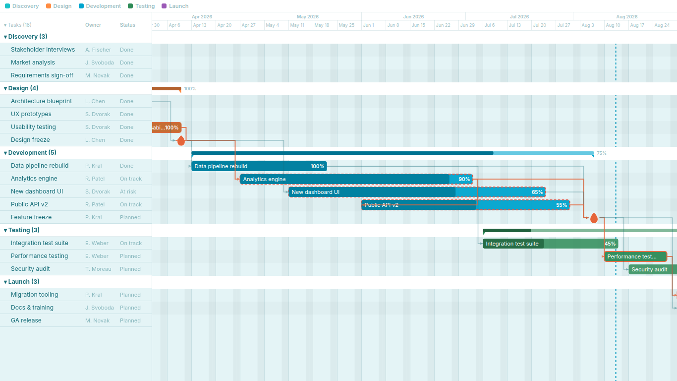
- 1Critical path and dependency arrows computed inside Power BI, no helper columns
- 2Plan-versus-actual baseline under every bar, progress as 0 to 1 or 0 to 100
- 3Collapsible hierarchy with owner, status and cost columns, zoom from years to weeks
- Widest feature set
- everything the category's incumbents do, plus what they skipped
- Ships as-is
- drop it on the canvas and the default render is already presentable
- Format pane that speaks your data
- real field and series names, every visible element adjustable
- Nothing leaves the report
- no external calls, no API keys, no telemetry: built to Microsoft's certification bar
Pick the category. The choice inside it should be obvious.
 Gantt Chart
Schedules with a collapsible task hierarchy, dependency arrows, critical path and plan-vs-actual baselines — all computed locally inside Power BI.
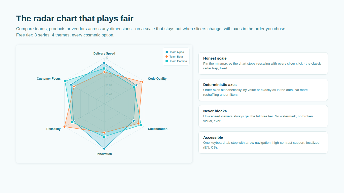
 Radar Chart
Compare teams, products or KPIs on a scale that stays put — normalization for mixed units, targets, zones, four chart modes and small multiples.
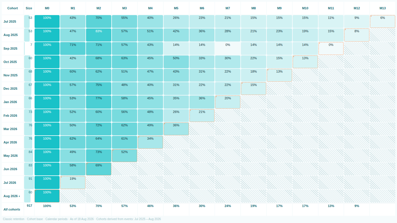
 Cohort Retention
Retention triangles from raw events — no period table, four denominators, three retention definitions, survival curves and honest handling of unobserved periods.
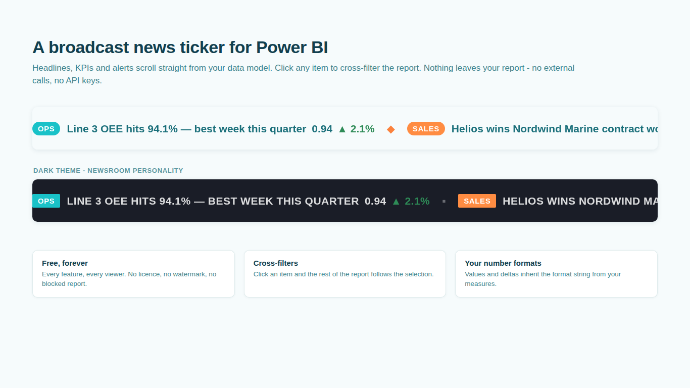
 News Ticker
A scrolling strip of headlines, KPIs and alerts fed straight from your data model — badges, up and down deltas, cross-filtering and full keyboard access. Free.
 Pareto Chart
Bars ranked by contribution, cumulative line, vital-few detection and an insight sentence, all computed in the visual — ABC zones, before/after comparison, a Minitab-style table and small multiples, no cumulative-percentage DAX to maintain.
 Crosstab
The banner table every insights team ships, inside Power BI — questions as blocks, segments as columns, column % with A/B/C letters on weighted effective bases, net and mean rows, sticky headers and a 30,000-row banner that scrolls like a native table. Read the methodology
 Likert
Diverging stacked bars with the neutral split on the axis, N/A detached, top and bottom box nets, means, tracker mode and benchmark deltas — plus significance letters between segments on weighted effective bases. Read the methodology
 NPS
NPSHeadline score, promoter / passive / detractor split and the trend over waves, with a significance test on every wave-over-wave change — so a +3 is reported as noise when it is noise. Segment letters, weighted NPS and a target line. Read the methodology
 SmartVisuals Research
The three Research suite views over one survey table, switched inside the visual — weighting, significance letters, nets and means from the same engine, validated against R and scipy. Read the methodology
 Countdown
A countdown bound to your data that keeps ticking between refreshes — deadline board, milestone track, days since the last event with streak records, working days and time zones handled honestly. Free.
 Leaderboard
Ranks readable from across the room, with movement against a comparison period that survives slicers, named tie rules, streaks and target pacing — no RANKX to maintain.
AI ChatbotAsk questions in natural language and get instant charts, insights, and DAX measures right inside your reports.
Depth you can actually configure.
Collapse a phase and the roll-up bar keeps its progress. Zoom to weeks and the dependency arrows follow. Every element you see has a control in the format pane, labelled with your real field names, and cards that do nothing for the fields you mapped stay hidden.
What every SmartVisual has to clear before it ships.
Every visual is measured against the best alternative on AppSource before it ships.
- 01Cover the category, then the gaps.Every feature the incumbents offer, plus the ones people keep re-building in DAX because nobody shipped them.
- 02Presentable with zero configuration.The default render on sample data has to look like the screenshot. If it needs ten tweaks to be shown, it is not done.
- 03A format pane that reads like your model.Real series and field names, never "Series 1". Everything drawn on screen is adjustable, and explicit choices survive a theme switch.
- 04Nothing leaves the report.Every feature runs inside the visual: no external calls, no API keys, no telemetry. Built to Microsoft's certification requirements from the first line.
- 05Compare us line by line.We would rather lose a sale than a comparison. If something is missing, tell us and it goes on the list.
What shipped lately.
- 19 Sep 2026SmartVisuals Research, the all-in-one suite visual, is live on AppSource. Certification requested for the whole Research suite and the Pareto Chart.
- 18 Sep 2026Pareto Chart, Crosstab, Likert and NPS are live on AppSource. The all-in-one SmartVisuals Research visual, Countdown and Leaderboard are in Microsoft review.
- 10 Sep 2026Gantt Chart, Radar Chart and Cohort Retention are live on AppSource.
- 31 Aug 2026Gantt Chart approved by AppSource review in the first round, zero findings.
- 30 Aug 2026Radar Chart submitted: cross-highlight, single-tab-stop keyboard navigation, English and Czech.
- 29 Aug 2026News Ticker is live on AppSource, certification requested.
Tell us what is missing.
A feature you need, a bug you hit, a visual that does not exist yet. Every message reaches the person who builds these visuals, and feature requests shape what ships next. We also build visuals to order.